


Low contrast text is the most common accessibility fail – and the easiest to fix. But the answer is not black and white. The rules are simple, and the fixes even simpler... it's a no-brainer.
Where to start
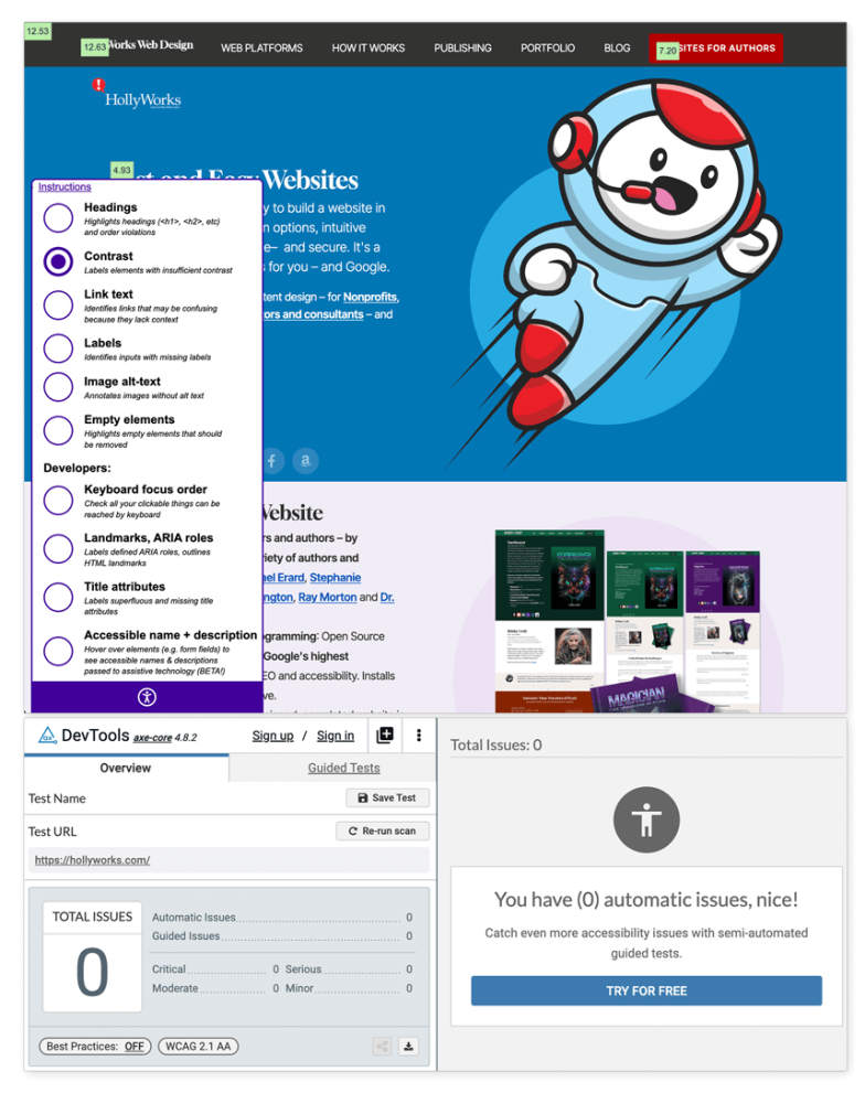
First, do a quick check of your website. I like a couple of Chrome plugins: tota11y and axe DevTools. Tota11y displays contrast for individual items on the page from a handy pop up while axe DT will dig a little deeper.
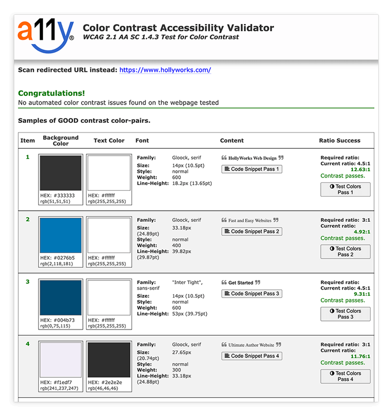
There are loads of other options: A11y.com gives a nice readout and spells out font data as well.
What are the rules?
The basic rules are simple: backgrounds and foregrounds need to have enough contrast so that text is readable, and as text gets smaller, that contrast needs to be more pronouned. Small text needs to hit the 4.5:1 mark while larger text should be 3:1. Providing tools like "dark mode" or humongo-type don't satisfy accessibility because they often create new problems with other page elements like buttons and links. Color should never be the only indicator of a "thing" - like blue links. You also need an underline. Reading white text on a black background is also harder on your eyes.
But what about my brand colors?
You've got a logo and you love it, but it's not considered good design to paint your entire website in brand colors – because then your logo no longer stands out.
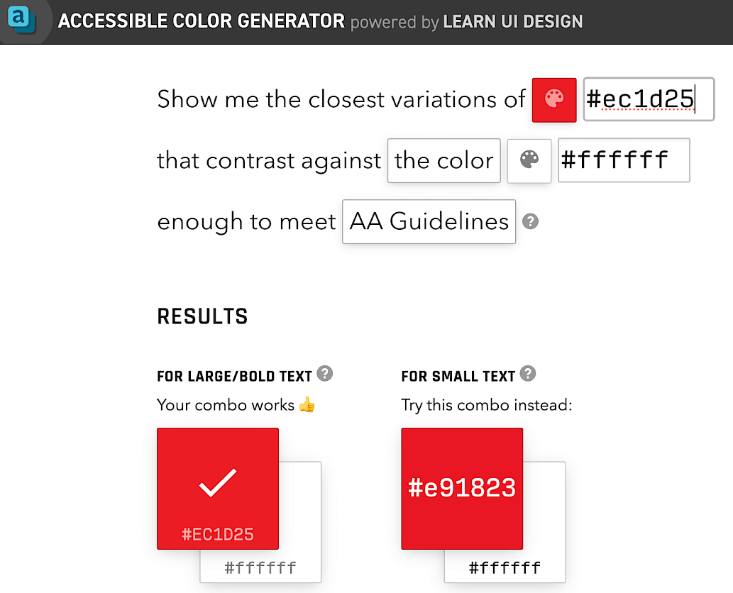
HollyWorks red is #ecid25. For large text that would be fine. For smaller text it can be tweaked a bit to be more readable - by using the Accessible Color Generator. If your brand is a pale green? Use a contrasting color.
Why should I care?
Eight percent of Americans have low vision issues if you need a stat to throw at somebody. Large companies will spend millions on consultants to try and crank and extra half percent in sales, while ignoring a whopping 8% of the population that could be addressed in a few minutes. It's a rare win when the right thing to do is also the easy thing to do. This is also why all my platforms include individual color controls allowing you to fine tune every color on the page – text and backgrounds.
Photo by Mika Baumeister on Unsplash